
- Step 1 :-
@OptIn(ExperimentalMaterial3Api::class)
@Composable
fun ExpandableCard(title: String, description: String) {
    var expandedState by remember { mutableStateOf(false) }
    val rotationicon by animateFloatAsState(
        if (expandedState) 180f else 0f, label = "rotation"
    )

    Card(
        modifier = Modifier
            .fillMaxWidth()
            .animateContentSize(
                animationSpec = spring(dampingRatio = Spring.DampingRatioHighBouncy, stiffness = Spring.StiffnessMedium)
            ), shape = ShapeDefaults.Large,
        onClick = {
            expandedState = !expandedState
        }
    ) {
        Column(
            modifier = Modifier
                .fillMaxWidth()
                .padding(12.dp)
        ) {

            Row {
                Text(
                    modifier = Modifier.weight(1f),
                    text = title,
                    fontSize = MaterialTheme.typography.headlineLarge.fontSize,
                    fontWeight = FontWeight.Bold,
                    maxLines = 1,
                    overflow = TextOverflow.Ellipsis
                )
                IconButton(modifier = Modifier
                    .alpha(1f)
                    .rotate(rotationicon), onClick = {
                    expandedState = !expandedState
                }) {

                    Icon(
                        imageVector = Icons.Default.KeyboardArrowDown,
                        contentDescription = "This is arrow down button"
                    )
                }
            }
            if (expandedState) {
                Text(
                    text = description, fontSize = MaterialTheme.typography.bodySmall.fontSize,
                    fontWeight = FontWeight.Bold,
                )

            }
        }
    }


}
- Step 2:- You can also change animation file to animate cardview while click
@OptIn(ExperimentalMaterial3Api::class)
@Composable
fun ExpandableCard(title: String, description: String) {
    var expandedState by remember { mutableStateOf(false) }
    val rotationicon by animateFloatAsState(
        if (expandedState) 180f else 0f, label = "rotation"
    )

    Card(
        modifier = Modifier
            .fillMaxWidth()
            .animateContentSize(
                animationSpec = tween(
                    durationMillis = 150, easing = LinearOutSlowInEasing
                )
            ), shape = ShapeDefaults.Large,
        onClick = {
            expandedState = !expandedState
        }
    ) {
        Column(
            modifier = Modifier
                .fillMaxWidth()
                .padding(12.dp)
        ) {

            Row {
                Text(
                    modifier = Modifier.weight(1f),
                    text = title,
                    fontSize = MaterialTheme.typography.headlineLarge.fontSize,
                    fontWeight = FontWeight.Bold,
                    maxLines = 1,
                    overflow = TextOverflow.Ellipsis
                )
                IconButton(modifier = Modifier
                    .alpha(1f)
                    .rotate(rotationicon), onClick = {
                    expandedState = !expandedState
                }) {

                    Icon(
                        imageVector = Icons.Default.KeyboardArrowDown,
                        contentDescription = "This is arrow down button"
                    )
                }
            }
            if (expandedState) {
                Text(
                    text = description, fontSize = MaterialTheme.typography.bodySmall.fontSize,
                    fontWeight = FontWeight.Bold,
                )

            }
        }
    }


} - In short , pasting only card animation code
Card(
    modifier = Modifier
        .fillMaxWidth()
        .animateContentSize(
            animationSpec = keyframes { durationMillis =2000  }
        ), shape = ShapeDefaults.Large,
    onClick = {
        expandedState = !expandedState
    }
) - also use reverse close animation for card
Card(
    modifier = Modifier
        .fillMaxWidth()
        .animateContentSize(
            animationSpec = repeatable(
                iterations = 2,
                animation = tween(durationMillis = 500, easing = FastOutSlowInEasing),
                repeatMode = RepeatMode.Reverse
            )
        ), shape = ShapeDefaults.Large,
    onClick = {
        expandedState = !expandedState
    }
) - for snap
Card(
    modifier = Modifier
        .fillMaxWidth()
        .animateContentSize(
            animationSpec = snap(delayMillis = 600)
        ), shape = ShapeDefaults.Large,
    onClick = {
        expandedState = !expandedState
    }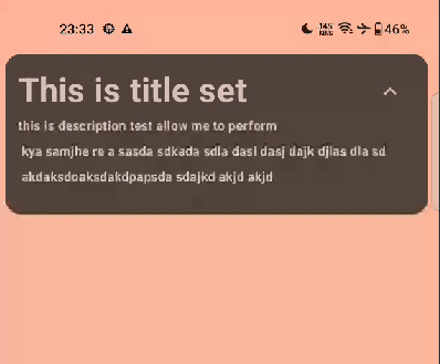
) - Screenshot :_

0 Comments